“This is a star, a lodestar for a company which aims to be a pathfinder in oil, gas and other energy forms,” says StatoilHydro employees who have seen the logo before its release.
The symbol has actually also been created on the basis of the Nordic starry sky, which in generations has served as a guide for people who seek to cross new borders.
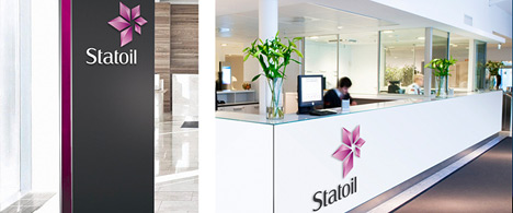
The star symbolises the ambition of further pioneer efforts on the Norwegian continental shelf and internationally, and of finding and creating more efficient energy.
The logo, or brand, is designed in the magenta colour, which is a mixture of red and purple. A lodestar should be strong and bright, and it was therefore a natural choice to use a forceful colour for the group’s new symbol.
Furthermore, this means that the company stands strongly out from its competitors.
The new visual expression, which has been developed in cooperation with Scandinavian Design Group (SDG), is implemented due to the need for a renewal of the corporate profile. The group has great growth ambitions internationally, and wanted a distinct visual identity which could work as a driving force in this process.
The name will be decided on the company’s Annual General Meeting on 19 May. The legal date for changing the name from StatoilHydro to Statoil is 1 November this year.
From that day, the Statoil name will be connected to two different profiles: “the drop” as we know it will continue to mark the Statoil identity on our service stations both domestically and abroad. It is primarily in Norway that both symbols will be seen. The Statoil identity of the service stations is so familiar and incorporated that the fuel companies will benefit from developing this further.
The assessment is that this part of the group’s operations can compete well on its own premises with its needs and target groups. In addition, the cost of changing the profile of the network of service stations is estimated at nearly NOK 2 billion, an expense which in any case is beyond consideration in the current situation.
The change of profile will entail new signs and flags and change of much material in the 42 countries we operate in. In addition, 26 offshore installations will be rebranded. The physical part is not the most important.
The group will use the momentum such a change could create to clarify its ambitions and strategy for the future, and to shed light on issues which are important for the company's future.